top of page

My circle of friends
Data visualization
An interactive visualization that displays the different relationships of a social network.
Timeline
Category
Type
My role
Tools
2 weeks
Data visualization
Graphic
Graphic designer, Interaction designer
Figma
This project was realized during my first year of study in Human Computer Interaction as an assignment.
The objective was to create a visualization from a social network matrix.
Design process
Design
Design concept
Implement
Prototype in Figma
Data visualization design
We first started with a social database presented in a matrix format. The 5 types of relationship depicted in the matrix can be quantified in terms of importance and intensity, or closeness.
I chose to design a visualization based on closeness because this word evokes both the proximity of people and spatial proximity, and thus can easily be put in parallel.
Thus, I designed a graphic inspired by the concentric circles of the radial node-link drawing.
One bubble displays the 5 types of relationship of the targeted person quoted in the center. Inside a bubble, the closer the circle is to the center, the stronger the relationship is.
I interpreted 5 levels, from the weakest to the strongest feelings:


Prototype on Figma
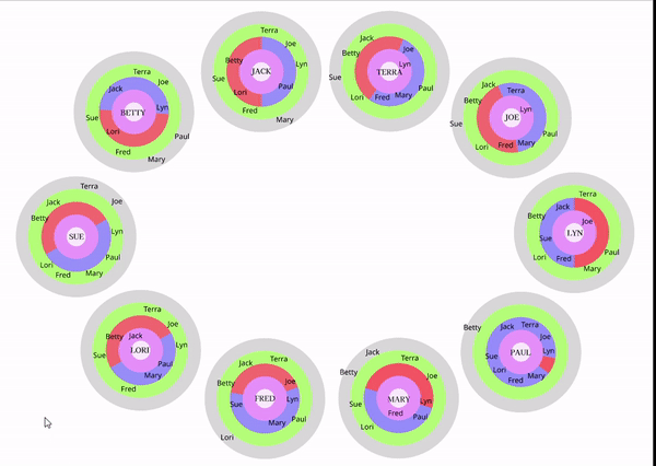
If the user hovers a bubble, it zooms in and displays more detailed information on how people feel about the targeted person through the corresponding colored arrows.
Here, Joe knows Betty and it is reciprocal, while Joe does not know Sue, but she loves Joe...

I used an specific initial layout of the 10 persons. You can notice that Terra is always located on top in every bubble and on top of the full display. It’s easy to spot Terra as her position is constant & compare how each person feel about her.
bottom of page